
Project Overview
Project: Wave Grocery - E-commerce Website Redesign
Company: Desquared S.A
My Role: UX/UI Designer
Team: Collaborated with designers, product managers, developers, and client stakeholders
Context / Problem
The team’s goal was to deliver a complete 360° solution for grocery stores. The existing design felt outdated and offered limited personalization.
My role focused on redesigning the web store and creating a design system with white-label components. This system enabled clients to tailor key elements of the site, such as the header, footer, homepage, and product tiles, allowing them to reflect their brand identity while differentiating themselves from other retailers using the platform.
Goals
Create a clean, user-friendly, brand-flexible design that enhances usability and conversion.
Our main purposes were to:
Improve product discovery through better navigation, search, and filters
Simplify the checkout flow for speed and clarity
Create a clean, modern UI that builds trust
Ensure white-label flexibility so each client can adapt branding easily
Process
Research & Benchmarking
Studied local and international competitors (AB, Sklavenitis, e-Fresh, Tesco, Walmart, Instacart) to identify grocery-specific UX best practices.
Wireframing & Iterations
Explored flows for homepage, product listing, product detail, cart, and checkout.
Design System
Created modular components (product cards, banners, filters, cart widget) to support rapid deployment across multiple supermarket brands.
Prototyping & Feedback
Built interactive prototypes and refined them through internal reviews and client demos.
QA Testing
Performed hands-on QA to check usability, verify UI consistency, validate component behaviour, and ensure the final implementation aligned with the design across devices and browsers.
Solution
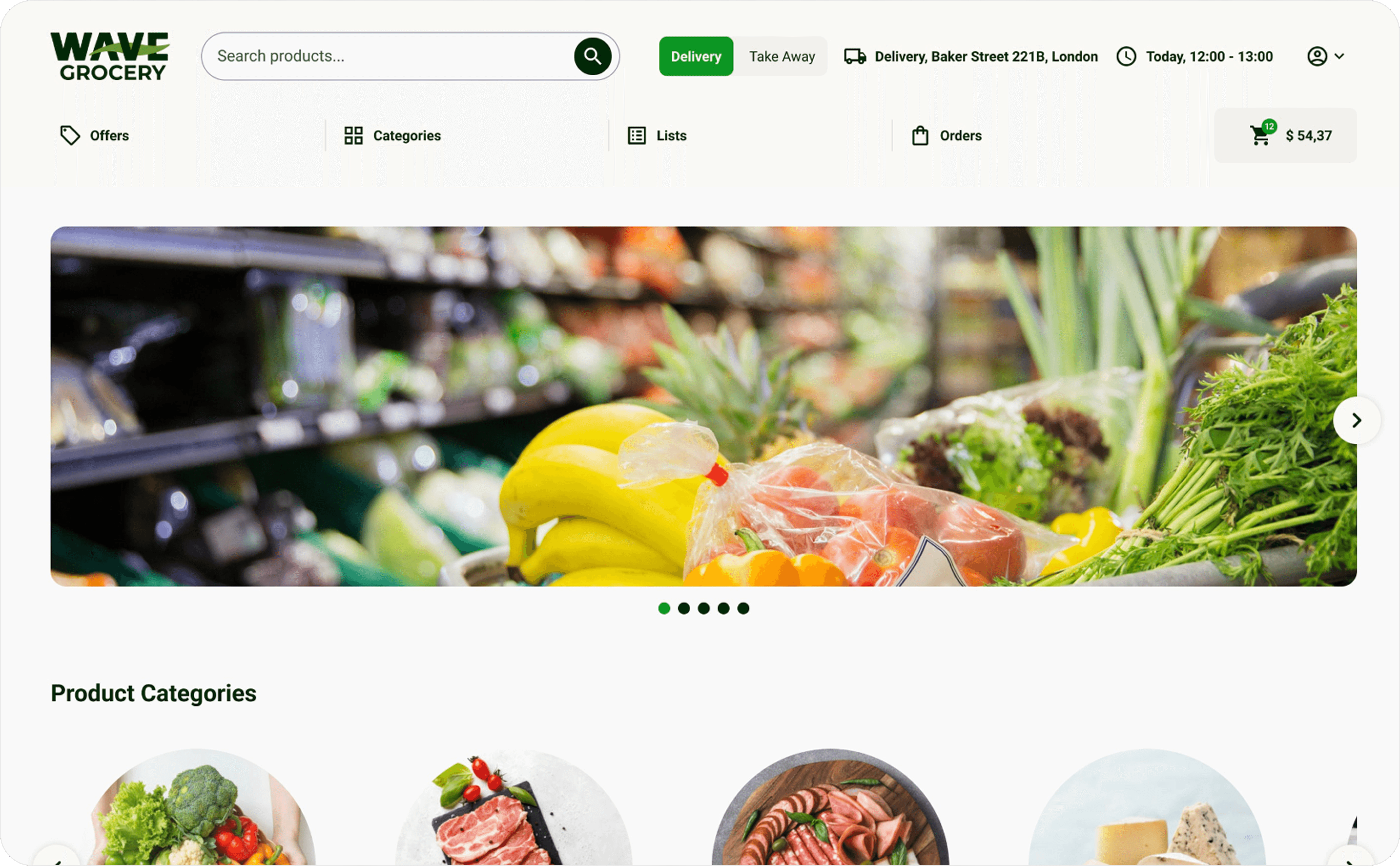
Homepage
Built to give clients full flexibility while guiding users clearly through key content and offers.
A fully customizable homepage built with mix-and-match components, giving clients the flexibility to tailor layouts to their specific needs and goals.
Clear promotion areas and prominent category entry points to guide users effortlessly.
Highlighted seasonal offers and banners to support timely campaigns and increase visibility.
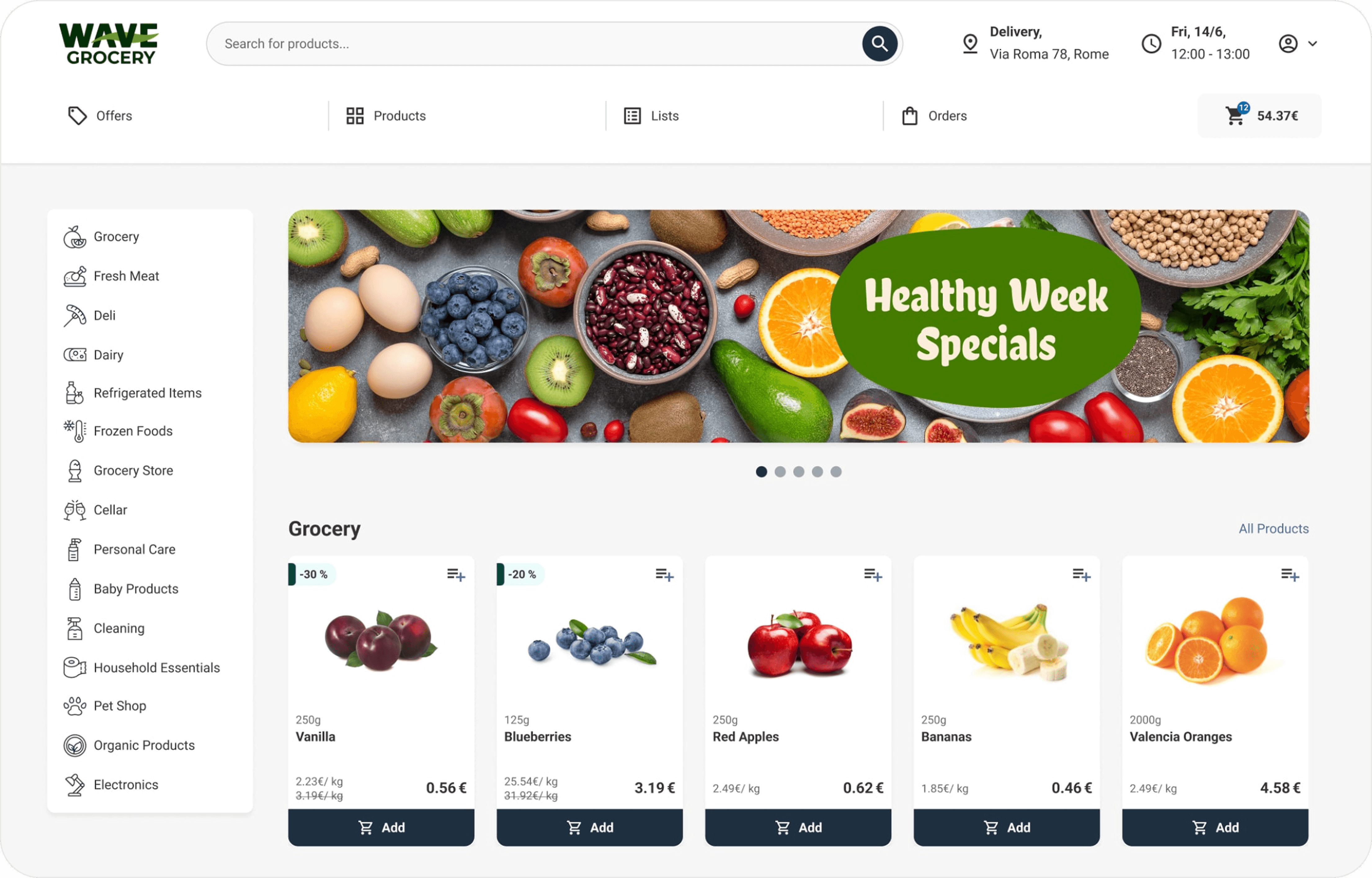
Product Listing
Designed to make browsing and selecting products faster and more intuitive for users.
Streamlined navigation for faster product discovery.
Clean, structured grid layout with filters and quick add-to-cart actions.
Detailed product details, including variations such as weight, pack size, and price per kilo.
Cart & Checkout
Simplified cart view
Step-by-step checkout with progress indicator
Corporate Pages
Designed a fully customizable corporate page system, offering multiple page types (promotional pages, blog layouts, store locator with map) and modular components tailored to each format. This flexibility allows every client to create and manage all the corporate content they want to showcase, while maintaining brand consistency and clear structure.
White-Label Design
We designed the platform with a white-label foundation, giving key components such as the header, footer, homepage, and product tile the flexibility to adapt to each client’s branding, layout preferences, and functional needs.
Learnings & Reflections
Designing for white-label adaptability means balancing flexibility with UX consistency
Grocery shopping flows are unique (reorders, delivery slots, weight options) and need specialized design thinking
Cross-functional collaboration was key to aligning design with tech constraints
Project Overview
Project: Wave Grocery - E-commerce Website Redesign
Company: Desquared S.A
My Role: UX/UI Designer
Team: Collaborated with designers, product managers, developers, and client stakeholders
Context / Problem
The team’s goal was to deliver a complete 360° solution for grocery stores. The existing design felt outdated and offered limited personalization.
My role focused on redesigning the web store and creating a design system with white-label components. This system enabled clients to tailor key elements of the site, such as the header, footer, homepage, and product tiles, allowing them to reflect their brand identity while differentiating themselves from other retailers using the platform.
Goals
Create a clean, user-friendly, brand-flexible design that enhances usability and conversion.
Our main purposes were to:
Improve product discovery through better navigation, search, and filters
Simplify the checkout flow for speed and clarity
Create a clean, modern UI that builds trust
Ensure white-label flexibility so each client can adapt branding easily
Process
Research & Benchmarking
Studied local and international competitors (AB, Sklavenitis, e-Fresh, Tesco, Walmart, Instacart) to identify grocery-specific UX best practices.
Wireframing & Iterations
Explored flows for homepage, product listing, product detail, cart, and checkout.
Design System
Created modular components (product cards, banners, filters, cart widget) to support rapid deployment across multiple supermarket brands.
Prototyping & Feedback
Built interactive prototypes and refined them through internal reviews and client demos.
QA Testing
Performed hands-on QA to check usability, verify UI consistency, validate component behaviour, and ensure the final implementation aligned with the design across devices and browsers.
Solution
Homepage
Built to give clients full flexibility while guiding users clearly through key content and offers.
A fully customizable homepage built with mix-and-match components, giving clients the flexibility to tailor layouts to their specific needs and goals.
Clear promotion areas and prominent category entry points to guide users effortlessly.
Highlighted seasonal offers and banners to support timely campaigns and increase visibility.
Product Listing
Designed to make browsing and selecting products faster and more intuitive for users.
Streamlined navigation for faster product discovery.
Clean, structured grid layout with filters and quick add-to-cart actions.
Detailed product details, including variations such as weight, pack size, and price per kilo.
Cart & Checkout
Simplified cart view
Step-by-step checkout with progress indicator
Corporate Pages
Designed a fully customizable corporate page system, offering multiple page types (promotional pages, blog layouts, store locator with map) and modular components tailored to each format. This flexibility allows every client to create and manage all the corporate content they want to showcase, while maintaining brand consistency and clear structure.
White-Label Design
We designed the platform with a white-label foundation, giving key components such as the header, footer, homepage, and product tile the flexibility to adapt to each client’s branding, layout preferences, and functional needs.
Learnings & Reflections
Designing for white-label adaptability means balancing flexibility with UX consistency
Grocery shopping flows are unique (reorders, delivery slots, weight options) and need specialized design thinking
Cross-functional collaboration was key to aligning design with tech constraints