
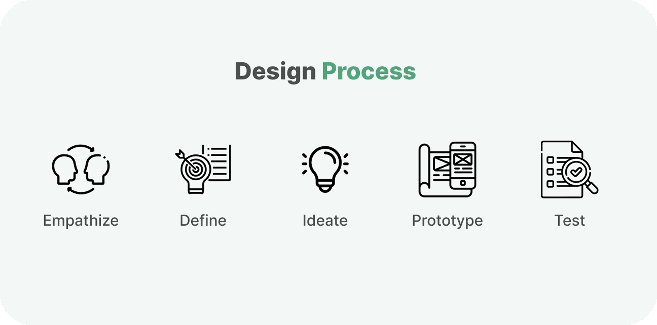
Sked is designed to help businesses manage employee schedules more efficiently, reducing the time and effort needed to create and maintain them
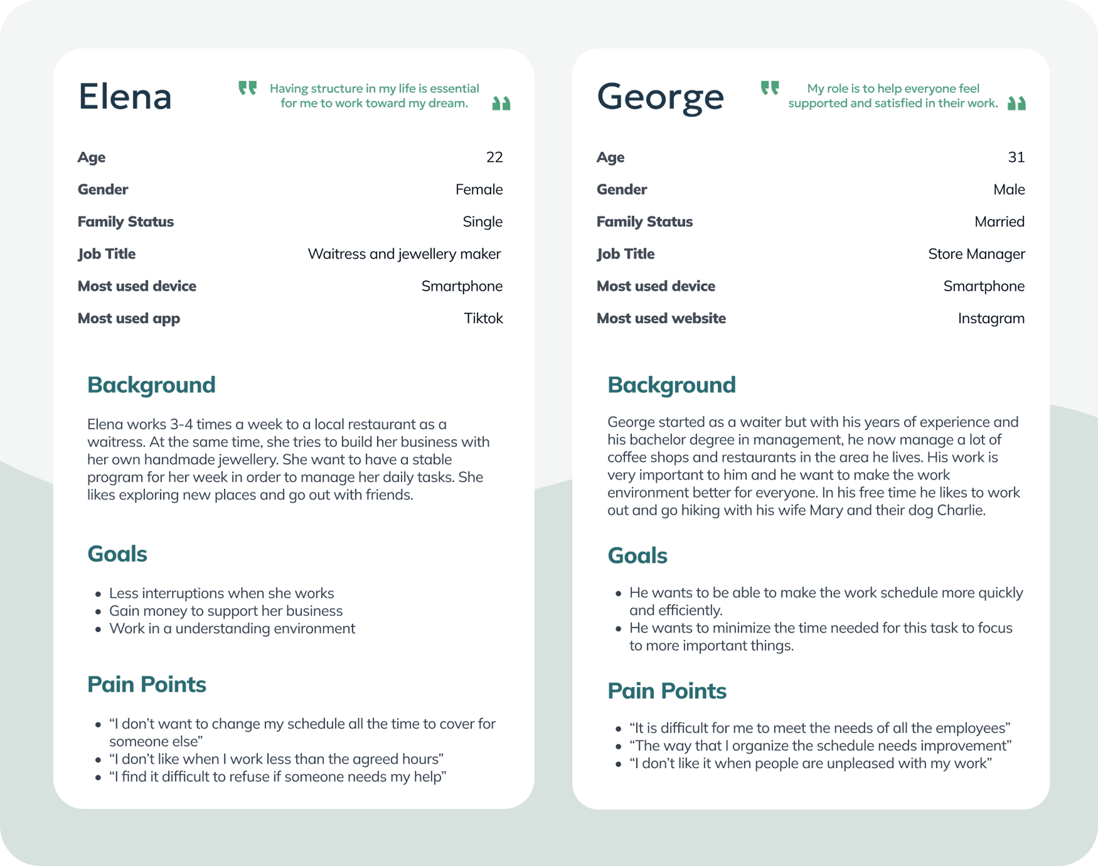
Personas
For this project, it was essential to understand both the challenges employees face when receiving their schedules and the difficulties store managers encounter in balancing everyone’s needs and preferences. The personas below represent these two primary user groups.
User Stories
Elena
As a waitress with a side hustle, I want to clearly see my weekly schedule so that I can plan my tasks and stay on top of everything I’m trying to accomplish.
George
As a manager overseeing multiple coffee shops and restaurants, I want to create work schedules more efficiently to reduce the time spent on this task and ensure everyone is satisfied.
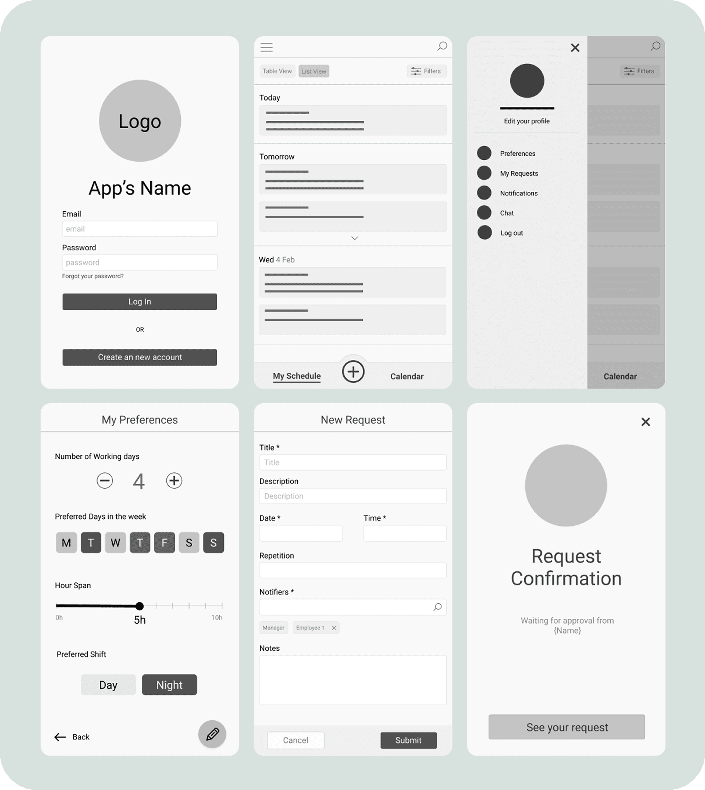
Wireframes
Before the Usability Study
Usability Study
Research Questions
How easily can users create a new request?
How many steps are required to modify an existing request?
At which points, if any, do users get stuck or experience confusion?
How do users feel while interacting with the app?
What improvements can enhance the app’s overall usability?
KPIs
Time on Task
Conversion Rate
User Error Rates
System Usability Scale (SUS)
Methodology
Moderated usability study
Location: Greece, conducted remotely
Timeline: Sessions scheduled between March 19–30 during standard business hours
Session length: Each session lasted 20–30 minutes and followed a structured list of prompts
Participants
Participants worked in restaurant settings across a variety of roles, with some holding two positions simultaneously. The group consisted of five individuals (2 males and 3 females), ranging in age from 18 to 60.
Moderated Usability Study Tasks
During the moderated usability sessions, participants were guided through a series of prompts displayed on the device:
Prompt 1:
Try entering your preferred working days and times for the week.
Follow-up: How easy or difficult was this task? Is there anything you would change in this process?
Prompt 2:
Modify a specific working day because it overlaps with one of your colleagues.
Follow-up: How clear was the overlapping indicator on the schedule?
Prompt 3:
Create a change request within an existing schedule.
Prompt 4:
Check whether your request has been approved or rejected by the restaurant manager.
Follow-up: How easy or difficult was it to locate your submitted request and understand its status?
Prompt 5:
From the home page, determine where you would go to edit your preferences.
Post-Study Evaluation: System Usability Scale (SUS)
After completing the tasks, participants filled out the System Usability Scale (SUS), rating the following statements from Strongly Disagree to Strongly Agree:
I think that I would use this app frequently.
I find the app unnecessarily complex.
I think the app is easy to use.
It is easy to navigate through the app.
I need instructions to use this app for the first time.
There are inconsistencies within the app.
I imagine that most people would learn to use this app quickly.
I feel confident using the app.
The main user flow is clear.
Usability Findings & Wireframes Iterations
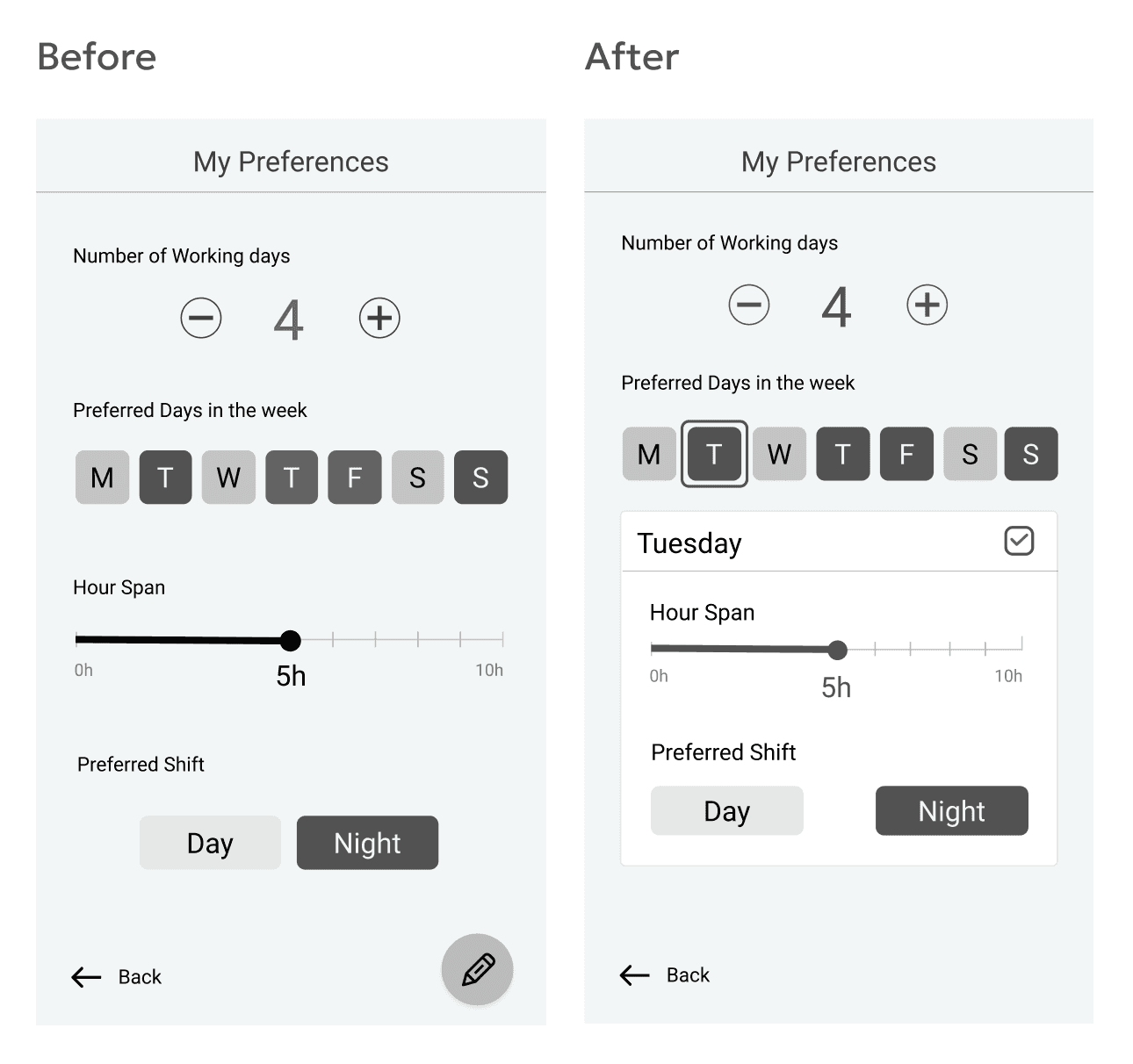
Most users expressed the need for more flexibility in the Preferences section.
Three out of five participants felt that the current Preferences page lacked sufficient options to fully reflect their scheduling needs. In particular, they wanted the ability to specify both their preferred working hours and shift type for each day of the week.As one participant noted:
“In the Preferences page, the user should be able to change the hours depending on the day of the week.” — Participant B
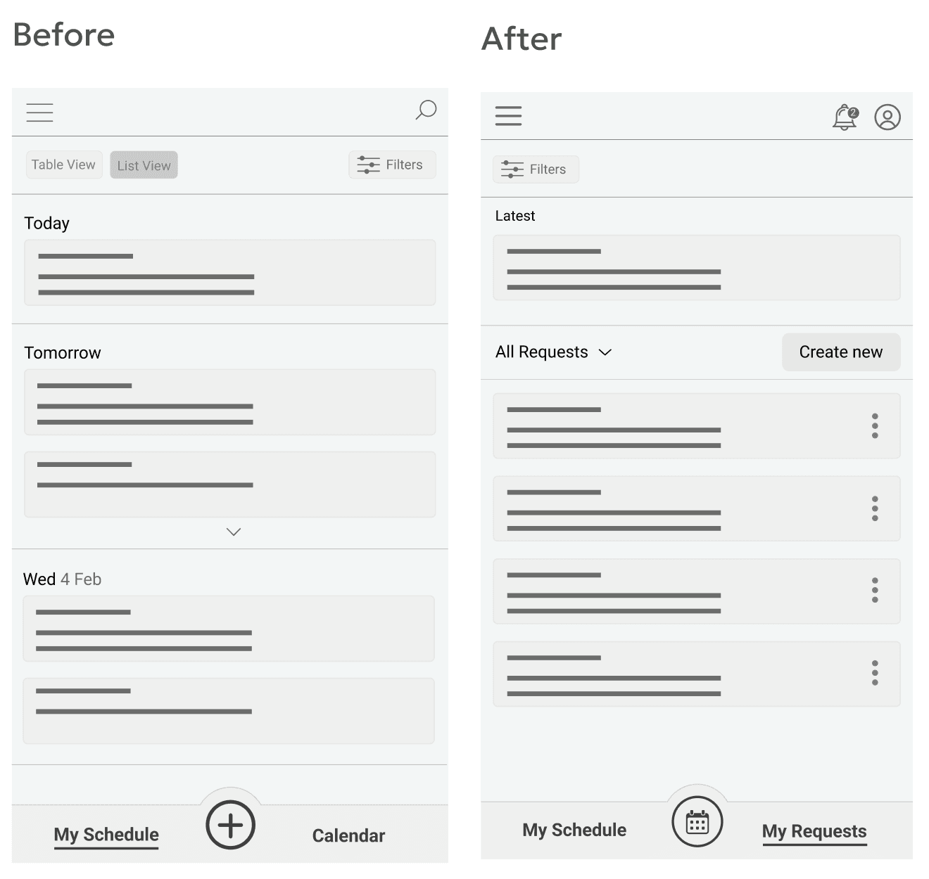
Issue: Low Visibility of the (+) Button
The (+) button was overlooked by most users.
Two out of five participants did not notice it at all, resulting in confusion when trying to create a new request or edit an existing one.As one participant mentioned:
“Instead of this (+) button, we should have a homepage button.” — Participant D
To address this issue, the navigation structure was refined:
The two main categories are now “My Schedule” and “My Requests”, replacing the previous “My Schedule” and “Calendar” labels.
Users can now go directly into My Requests to create a new request, as well as edit, copy, or delete existing ones.
The (+) button was replaced with a clearer calendar view, improving visibility and reducing confusion.
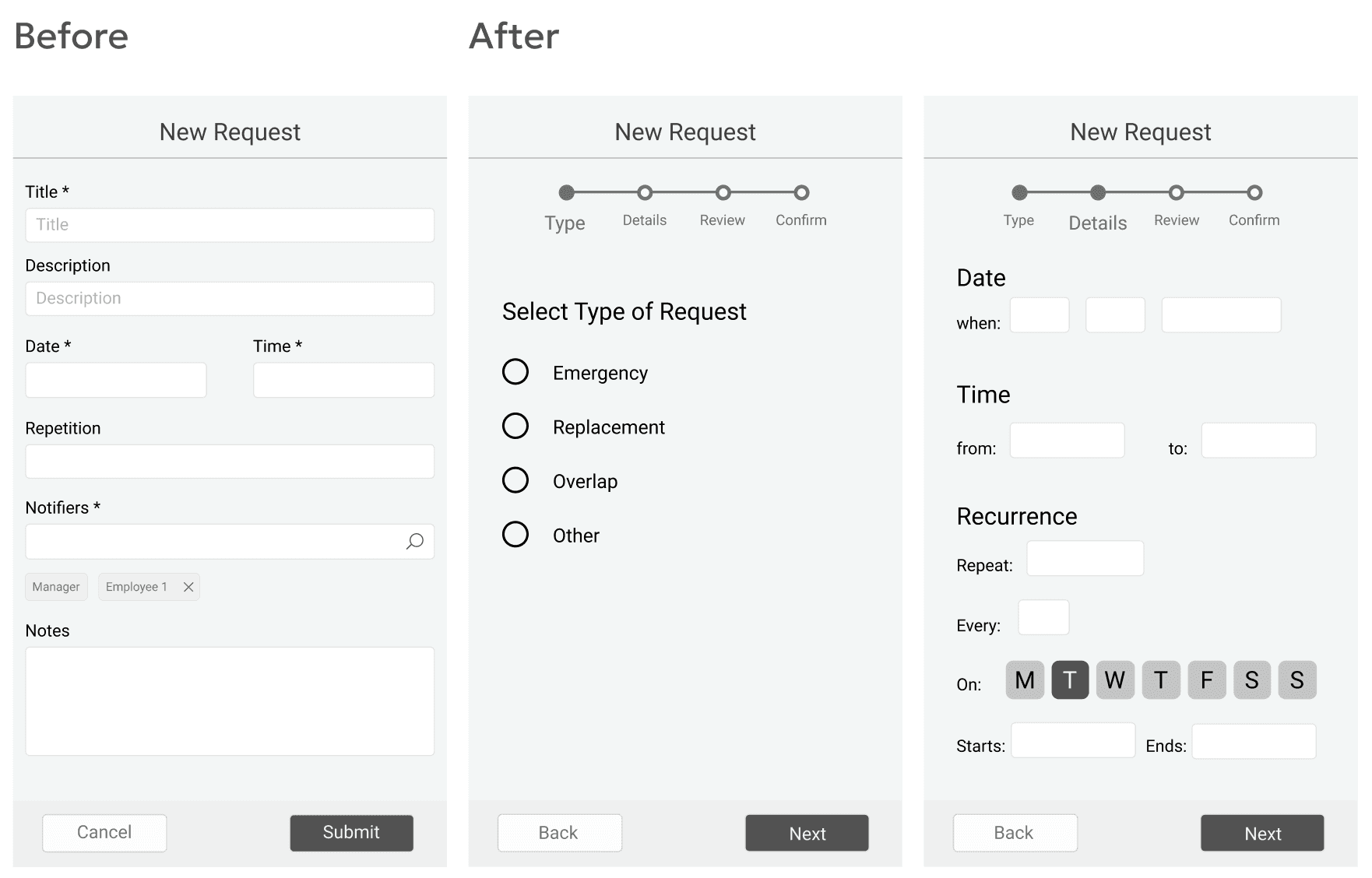
Issue: The Request Form Lacks Flexibility
Four out of five participants indicated that the current form for creating a new request needs significant improvement to support the different scenarios in which it might be used.
Participants raised questions and concerns about missing functionality:
“What happens if my new request should reoccur?” — Participant B
“In the Time field, can I select a range, from–to?” — Participant C
“I don’t think the Title and Description fields are needed. Anything I want to write can go in the notes.” — Participant E
These insights highlighted the need for a more intuitive and flexible request creation flow.
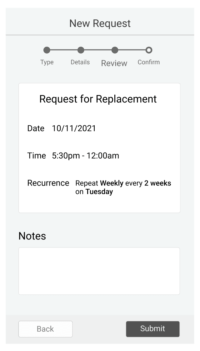
Missing Confirmation Step Before Submission
Two out of five participants expressed frustration when submitting a new request because the flow did not include a review step before final confirmation.
As one participant noted:
“I want to have a step between the form and the confirmation page, so I can check what I entered.” — Participant C
This insight emphasized the need for a review screen that allows users to verify their details before submitting a request.
Visual Designs
The visual designs apply a refined layout, clearer hierarchy, and more intuitive interaction patterns to address the issues discovered during testing, creating a smoother and more efficient scheduling experience for users.

Personas
For this project, it was essential to understand both the challenges employees face when receiving their schedules and the difficulties store managers encounter in balancing everyone’s needs and preferences. The personas below represent these two primary user groups.
User Stories
Elena
As a waitress with a side hustle, I want to clearly see my weekly schedule so that I can plan my tasks and stay on top of everything I’m trying to accomplish.
George
As a manager overseeing multiple coffee shops and restaurants, I want to create work schedules more efficiently to reduce the time spent on this task and ensure everyone is satisfied.
Wireframes
Before the Usability Study
Usability Study
Research Questions
How easily can users create a new request?
How many steps are required to modify an existing request?
At which points, if any, do users get stuck or experience confusion?
How do users feel while interacting with the app?
What improvements can enhance the app’s overall usability?
KPIs
Time on Task
Conversion Rate
User Error Rates
System Usability Scale (SUS)
Methodology
Moderated usability study
Location: Greece, conducted remotely
Timeline: Sessions scheduled between March 19–30 during standard business hours
Session length: Each session lasted 20–30 minutes and followed a structured list of prompts
Participants
Participants worked in restaurant settings across a variety of roles, with some holding two positions simultaneously. The group consisted of five individuals (2 males and 3 females), ranging in age from 18 to 60.
Moderated Usability Study Tasks
During the moderated usability sessions, participants were guided through a series of prompts displayed on the device:
Prompt 1:
Try entering your preferred working days and times for the week.
Follow-up: How easy or difficult was this task? Is there anything you would change in this process?
Prompt 2:
Modify a specific working day because it overlaps with one of your colleagues.
Follow-up: How clear was the overlapping indicator on the schedule?
Prompt 3:
Create a change request within an existing schedule.
Prompt 4:
Check whether your request has been approved or rejected by the restaurant manager.
Follow-up: How easy or difficult was it to locate your submitted request and understand its status?
Prompt 5:
From the home page, determine where you would go to edit your preferences.
Post-Study Evaluation: System Usability Scale (SUS)
After completing the tasks, participants filled out the System Usability Scale (SUS), rating the following statements from Strongly Disagree to Strongly Agree:
I think that I would use this app frequently.
I find the app unnecessarily complex.
I think the app is easy to use.
It is easy to navigate through the app.
I need instructions to use this app for the first time.
There are inconsistencies within the app.
I imagine that most people would learn to use this app quickly.
I feel confident using the app.
The main user flow is clear.
Usability Findings & Wireframes Iterations
Most users expressed the need for more flexibility in the Preferences section.
Three out of five participants felt that the current Preferences page lacked sufficient options to fully reflect their scheduling needs. In particular, they wanted the ability to specify both their preferred working hours and shift type for each day of the week.As one participant noted:
“In the Preferences page, the user should be able to change the hours depending on the day of the week.” — Participant B
Issue: Low Visibility of the (+) Button
The (+) button was overlooked by most users.
Two out of five participants did not notice it at all, resulting in confusion when trying to create a new request or edit an existing one.As one participant mentioned:
“Instead of this (+) button, we should have a homepage button.” — Participant D
To address this issue, the navigation structure was refined:
The two main categories are now “My Schedule” and “My Requests”, replacing the previous “My Schedule” and “Calendar” labels.
Users can now go directly into My Requests to create a new request, as well as edit, copy, or delete existing ones.
The (+) button was replaced with a clearer calendar view, improving visibility and reducing confusion.
Issue: The Request Form Lacks Flexibility
Four out of five participants indicated that the current form for creating a new request needs significant improvement to support the different scenarios in which it might be used.
Participants raised questions and concerns about missing functionality:
“What happens if my new request should reoccur?” — Participant B
“In the Time field, can I select a range, from–to?” — Participant C
“I don’t think the Title and Description fields are needed. Anything I want to write can go in the notes.” — Participant E
These insights highlighted the need for a more intuitive and flexible request creation flow.
Missing Confirmation Step Before Submission
Two out of five participants expressed frustration when submitting a new request because the flow did not include a review step before final confirmation.
As one participant noted:
“I want to have a step between the form and the confirmation page, so I can check what I entered.” — Participant C
This insight emphasized the need for a review screen that allows users to verify their details before submitting a request.
Visual Designs
The visual designs apply a refined layout, clearer hierarchy, and more intuitive interaction patterns to address the issues discovered during testing, creating a smoother and more efficient scheduling experience for users.