Industry

Rocketry

Rocket Control Dashboard — Concept Redesign

Main Project Image

Case Study

Overview

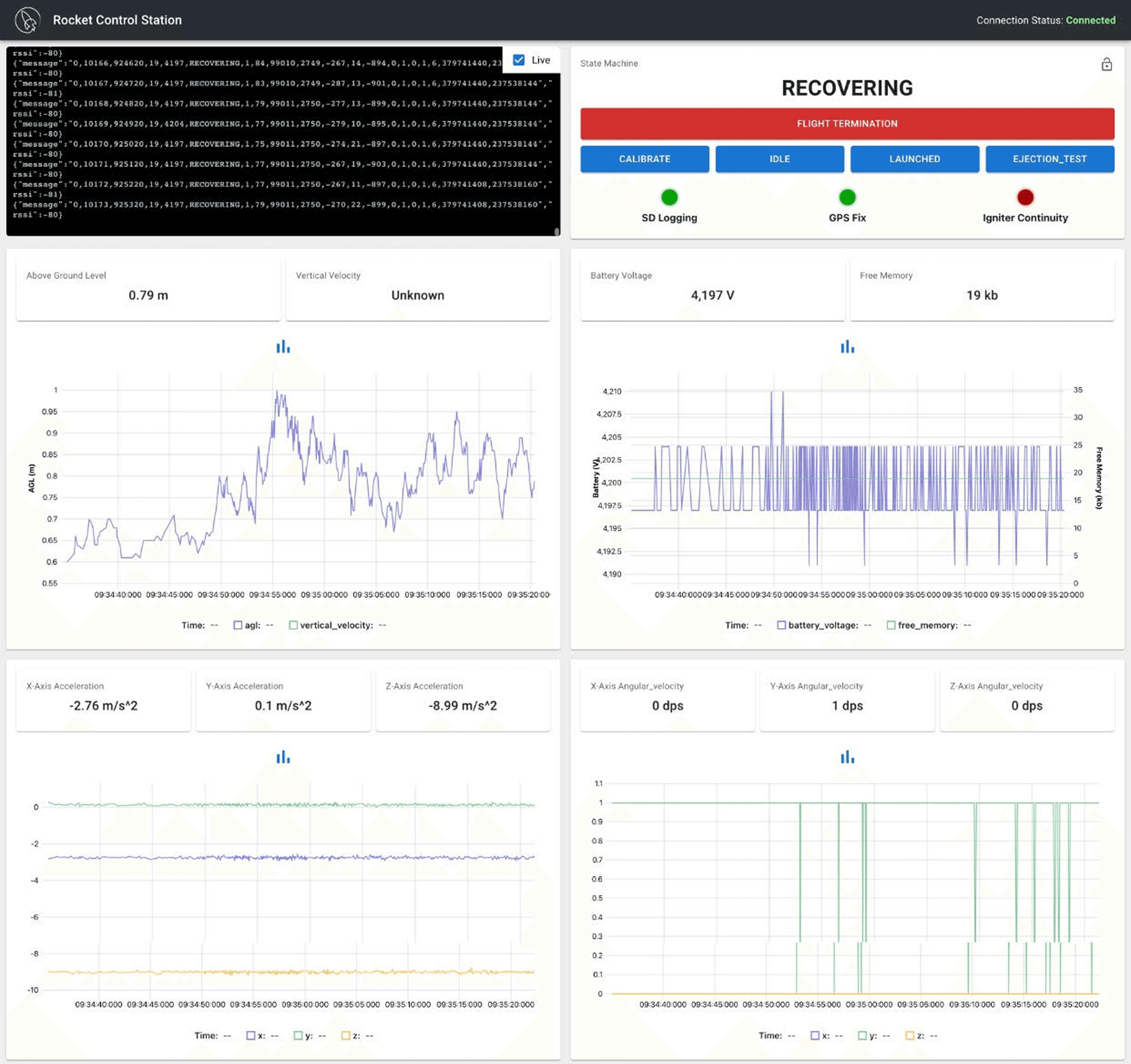
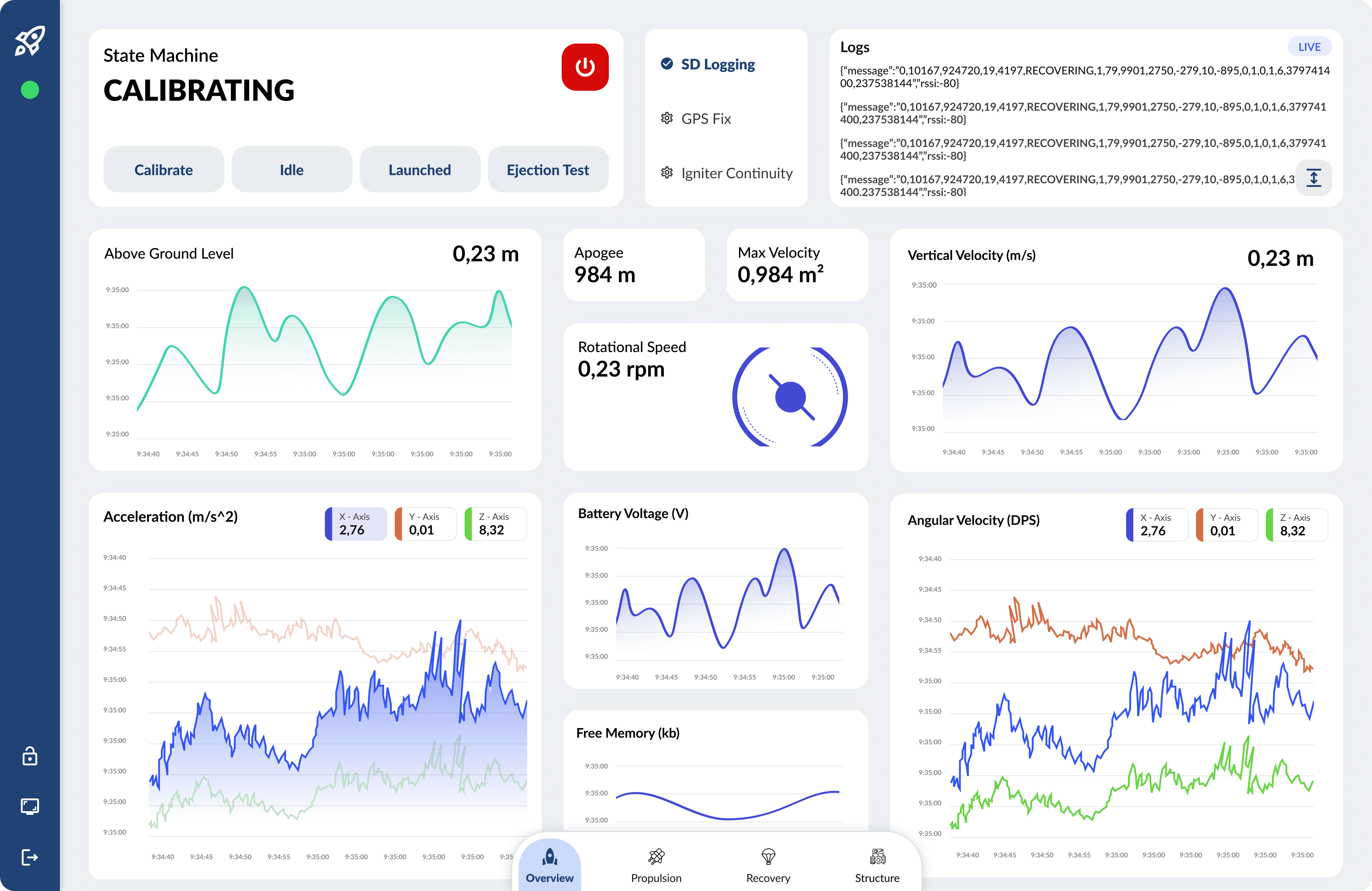
A personal redesign exploring how a high-density, real-time rocket control dashboard could be made more intuitive, readable, and structured. The original interface presented large amounts of telemetry data with little hierarchy. The goal was to improve clarity, reduce cognitive load, and create a more operator-friendly experience.

Challenges

  • Mixed visual styles and inconsistent chart formatting.

  • Important metrics were hard to scan and not visually prioritized.

  • Controls and system states were grouped without hierarchy.

  • Navigation relied on scrolling, making it hard to switch between subsystems.

Design Improvements

  • Introduced a clean, modular grid that organizes metrics into structured cards.

  • Refined graph visuals with consistent color coding and simplified data display.

  • Elevated key telemetry values (apogee, velocity, rotational speed) for faster recognition.

  • Redesigned the state machine and control buttons for better separation and safety.

  • Added bottom navigation to access subsystems (overview, propulsion, recovery, structure).

  • Created a modern visual language using consistent spacing, icons, and typography.

Outcome

A more readable and balanced dashboard where critical data is easier to interpret, interactions feel safer, and telemetry information is structured into clear, digestible sections.

Before
After

This redesign was created as a personal concept project and is not affiliated with any aerospace program. It serves as an exploration of system UI, data visualization, and high-complexity interface design.